AGUA DEL SOL
FULL REBRANDING - CUSTOM FONT DEVELOPMENT - COLLATERAL MATERIALS DESIGN
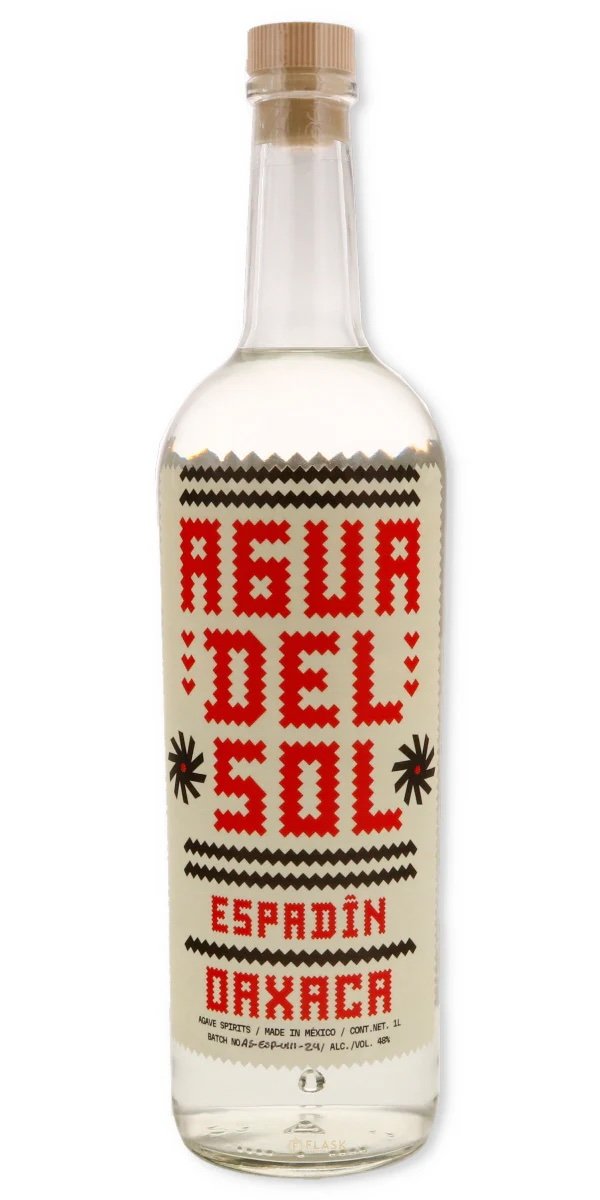
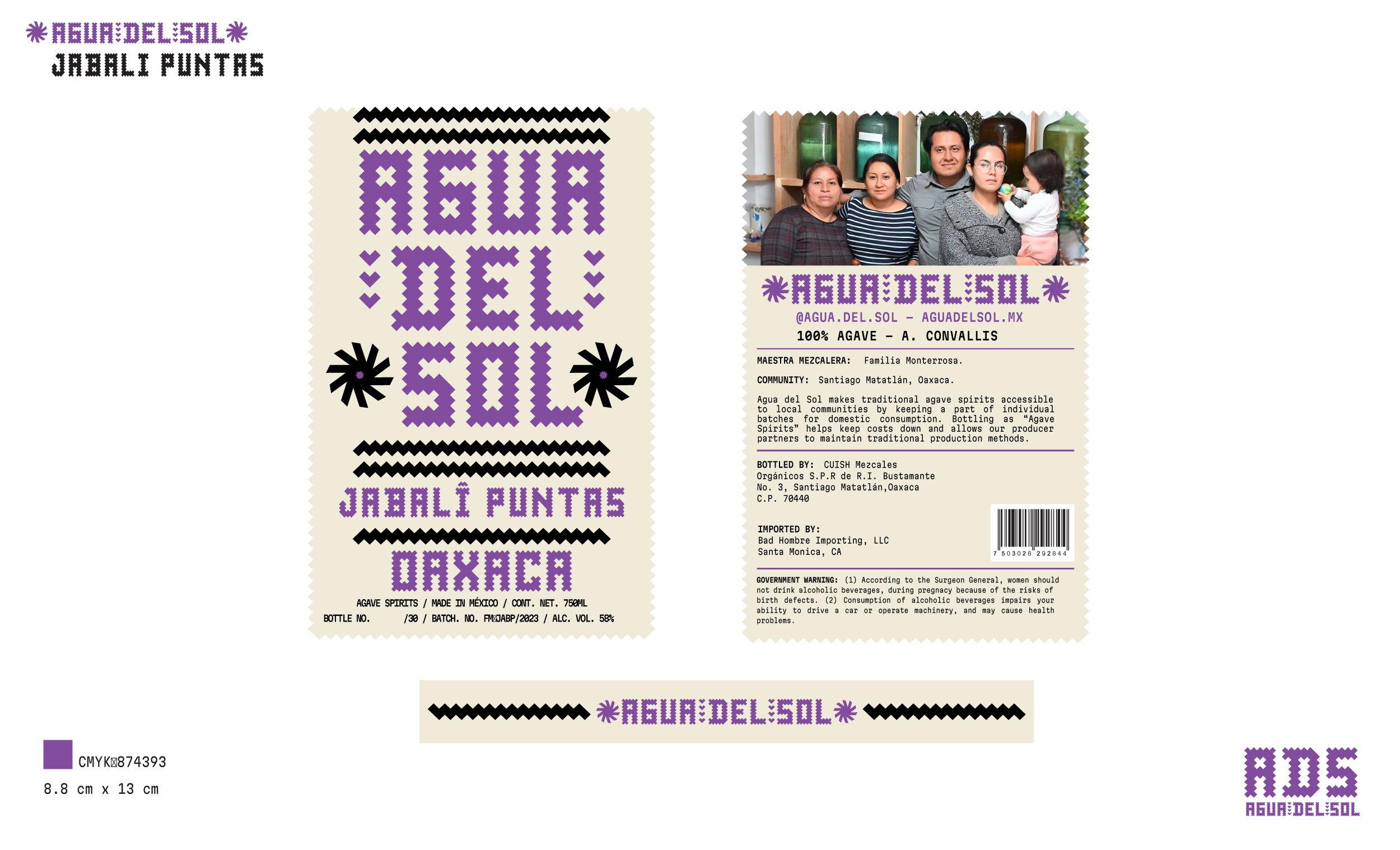
The rebranding of Agua del Sol was an incredible design exercise. I often referred to this project as the perfect example of the work I do as a graphic and artistic cultural interpreter. Having years of design experience in the world of Mexican distillates with TUYO.NYC and Buho mezcal, allowed me to have an instructed and eloquent conversation where a multitude of questions and answers opened the door to begin what became a couple of months of back and forth discovery work with Felix Monterroza, the cofounder of the brand and a multitalented Oaxacan visual artist. With a grid based on the palm weavings, the walls of the temple of Mitla, and the color palette of the natural dyes used in wool and cotton tapestry, the brand took form in an organic way. This process allowed us to synthesize the geometry and create a personalized custom font. achieving the main objective nailing down the true visual line that Agua del Sol would follow, ensuring that the final result would be a branding that represents their Zapotec roots and an esthetics that can grow with the evolution of the brand. afording them also a path to differentiate it from the vast ecosystem of mezcals that cohabitate on the shelves in the USA, making their offering memorable, unique, and recognizable.


OLD BOTTLE